Cynthia Kwik
Menu
Work
About
Contact
Awarded Organization Spot Bonus Individual Award. Boosted CVR significantly.
Improving Tokopedia checkout page
Context & responsibility
In Q1 2024, I was assigned to improve Tokopedia checkout page. I integrated payment selection into the checkout page to shorten the journey, and unify the OCC and Regular Checkout into one consistent structure, components, and information architecture.
Company
Tokopedia
Release date
Total of 5 phases (Q2 2024 - Q1 2025)
Role
Senior Product Designer
Why I won the Organization Spot Bonus Individual Award?
The project lacked a clear owner and required alignment across 3 big teams with 50+ core user scenarios. I took the lead in driving the initiative, enabling faster and more effective iterations based on user needs
Existing Tokopedia purchase flow
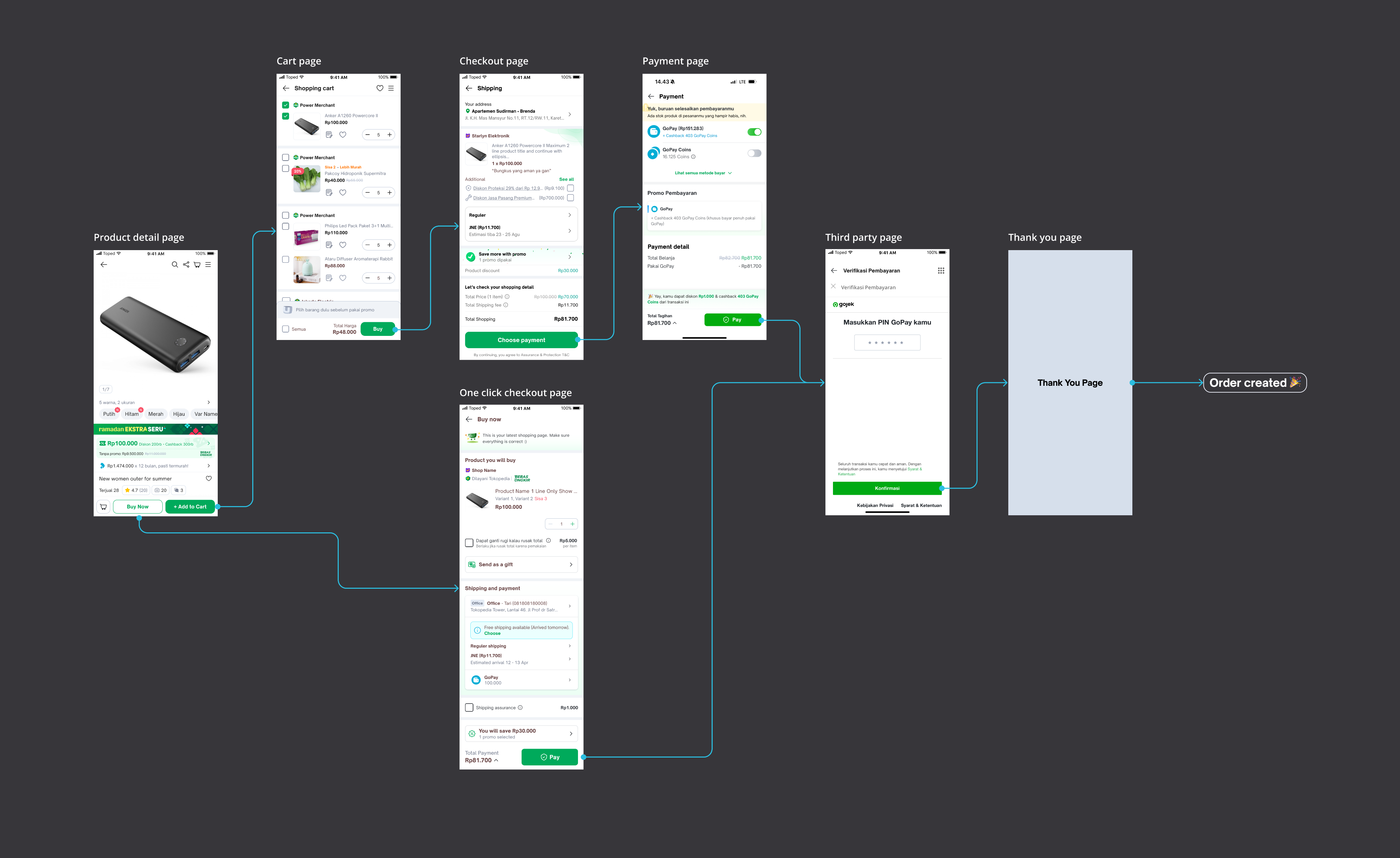
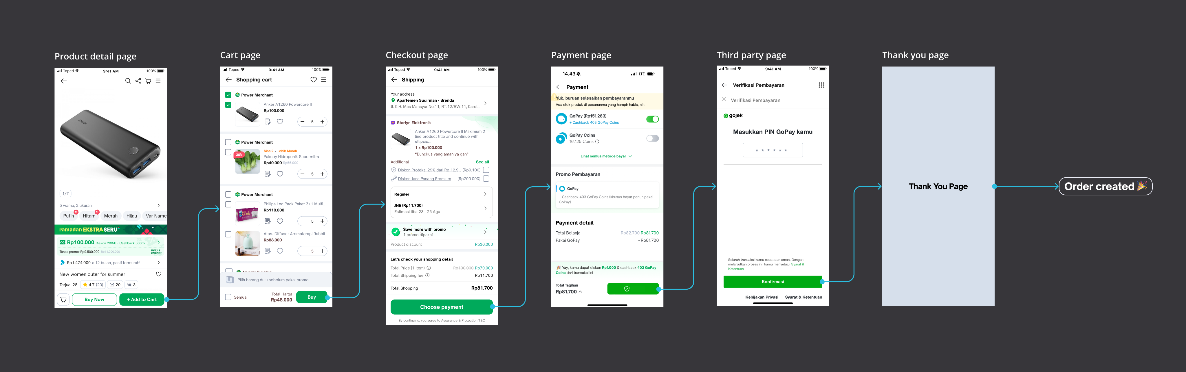
Users are able to enter checkout page directly from product detail page or traditionally from shopping cart page. After they enter checkout page, they have to go to payment page first then order is created. We see a lot of opportunities to improve in this purchase journey.
Identifying key problems
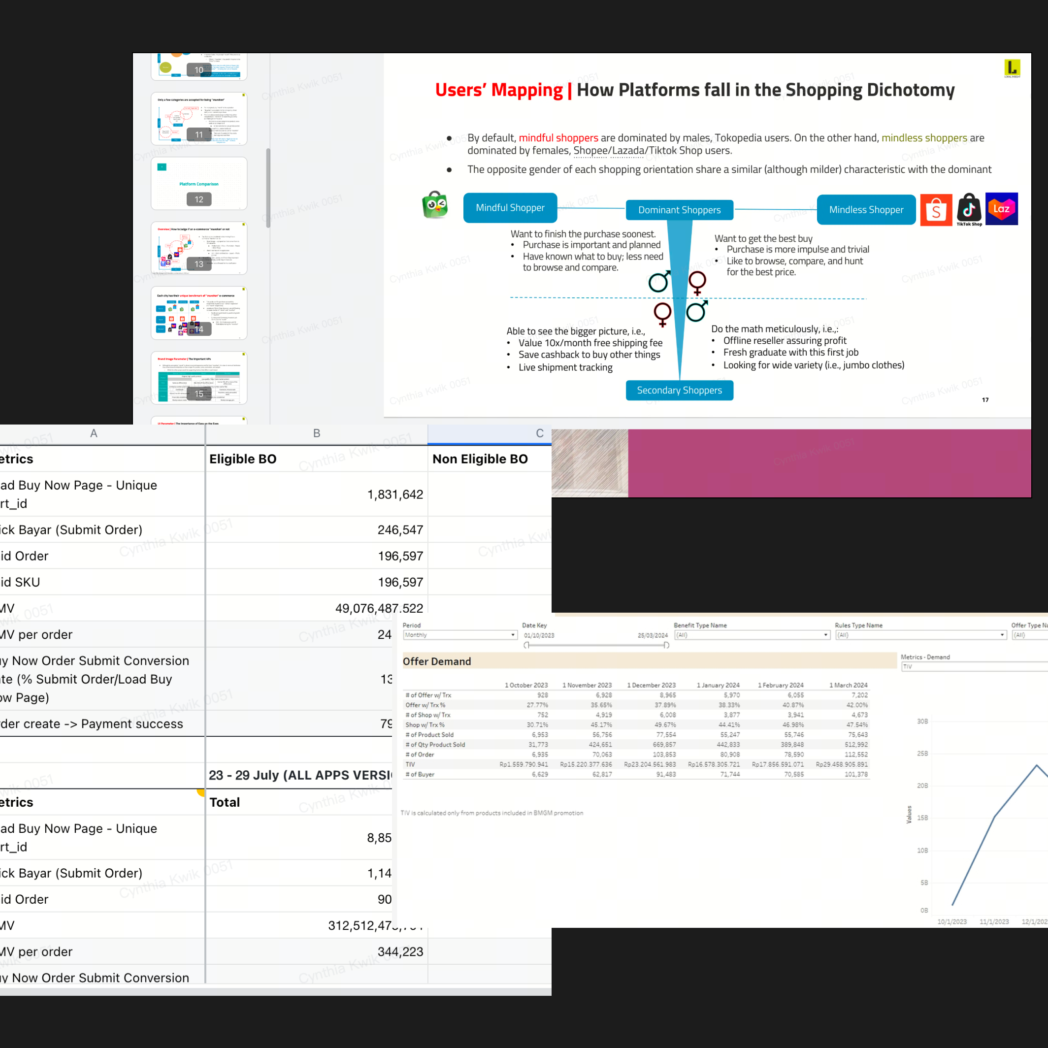
Analyze data and research
To get better understanding of how users interact with current design, finding pain point.
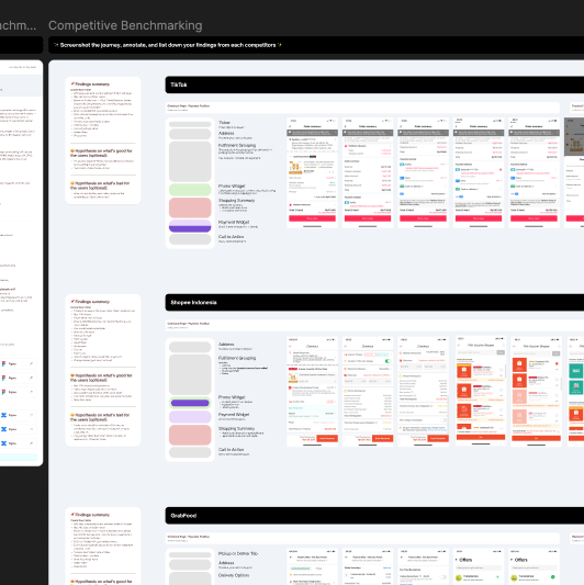
Competitive analysis
To discover feature gaps between Tokopedia and the competitors, by doing so we can find improvement opportunities.
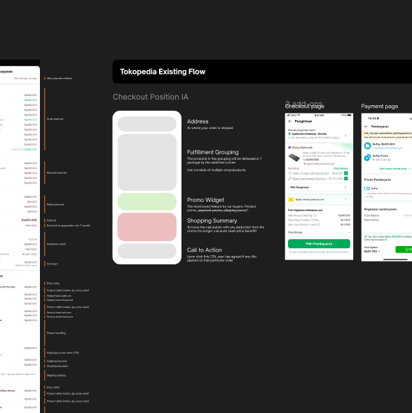
Design audit
To get better understanding of own design structure. Finding inconsistency and usability issues.
3 main problems that I found
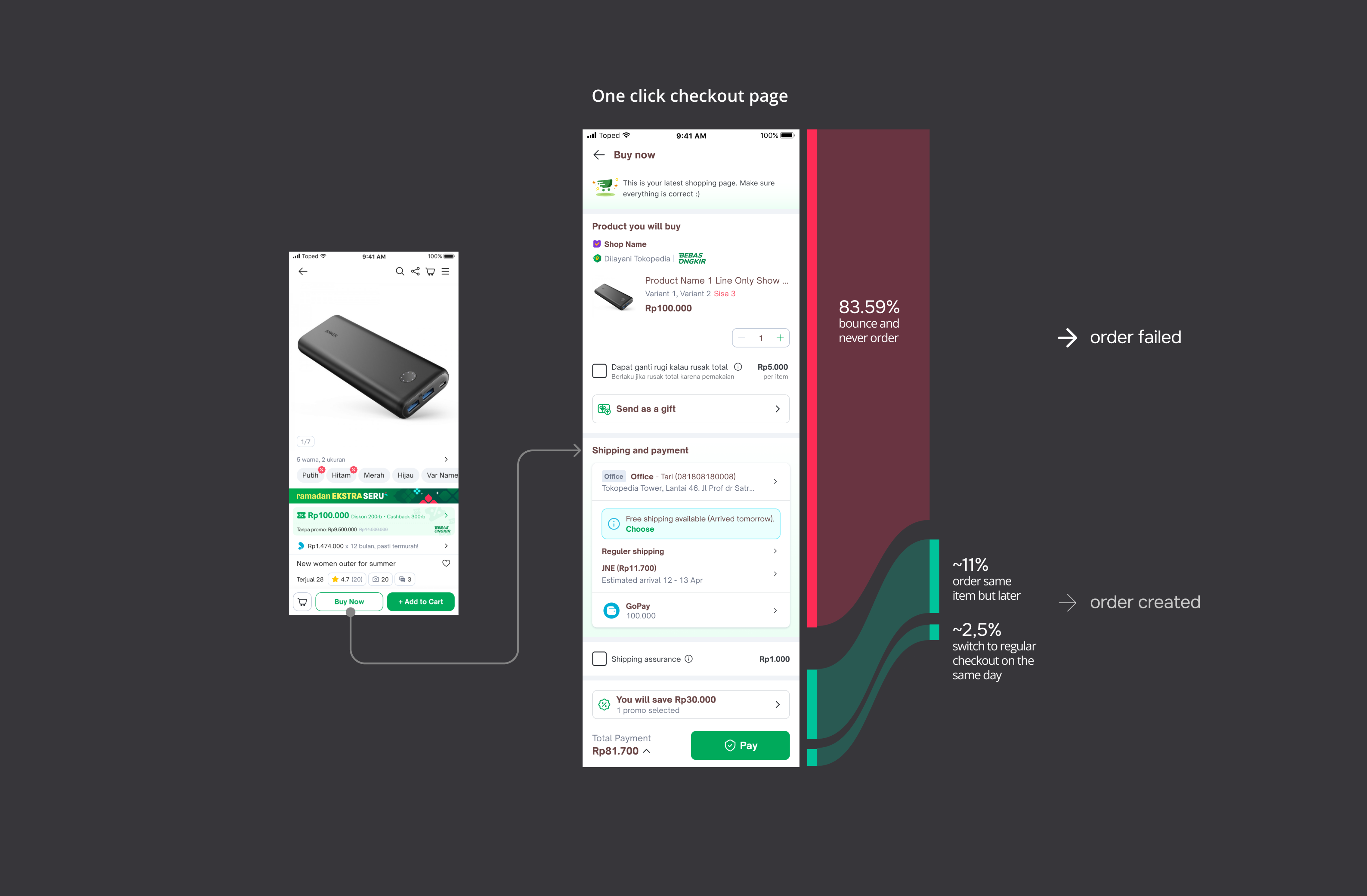
One click checkout page high exit rate
83.59% of buy now bounce and never order. ~11% order the same cart later, ~2.5% switch to regular checkout in same-day. But do we need this page in the first place? The answer is yes, it still shared 17.2% order of all order in Tokopedia. Hypothetically speaking, Tokopedia users ~83%
- High cost on maintaining two checkout pages
Separate checkout pages require duplicated design, engineering, QA, and maintenance efforts while serving the same purchasing goal. This limits scalability and slows future improvements.
- Too many steps to play an order
Current flow, user has to go through 4 pages, ≥ 7 clicks to place one order (Cart → SAF/Checkout → Payment list → Thank You).
These steps proven a pain point to the user through 3 data I got:
Competitive benchmarking
Most major competitors already implement payment-in-checkout for a seamless experience.
Observation
Users are bouncing back from the Payment page to the Checkout page, indicating the dedicated payment step created friction and lower the conversion rate.
Research
User said “I need to go go through multiple pages to proceed to payment, and I need to go back and forth between checkout and payment page to check everything”
I am also looking for supporting data and found ~11.13% of Buy Now users actively click "payment" on the one click checkout page widget meaning ~89% accept the pre-selected recommended payment method without ever opening the full list. So hypothesis integrating payment into the checkout page might be the solution.
How might we
To tackle those issues, 3 points need to be addressed
How might we
improve one click checkout user journey?
How might we
deliver a consistent and scalable checkout experience across different purchase journeys?
How might we
escalate user shopping journey while also minimizing order cancellations?
Objectives
Improve one click checkout experiences that encourages user to complete the purchase
Objectives
Create a consistent and scalable checkout experience across different purchase flows.
Objectives
Simplify the checkout process while ensuring users can confidently review and complete their orders.
How I solved it, starting by mapping out
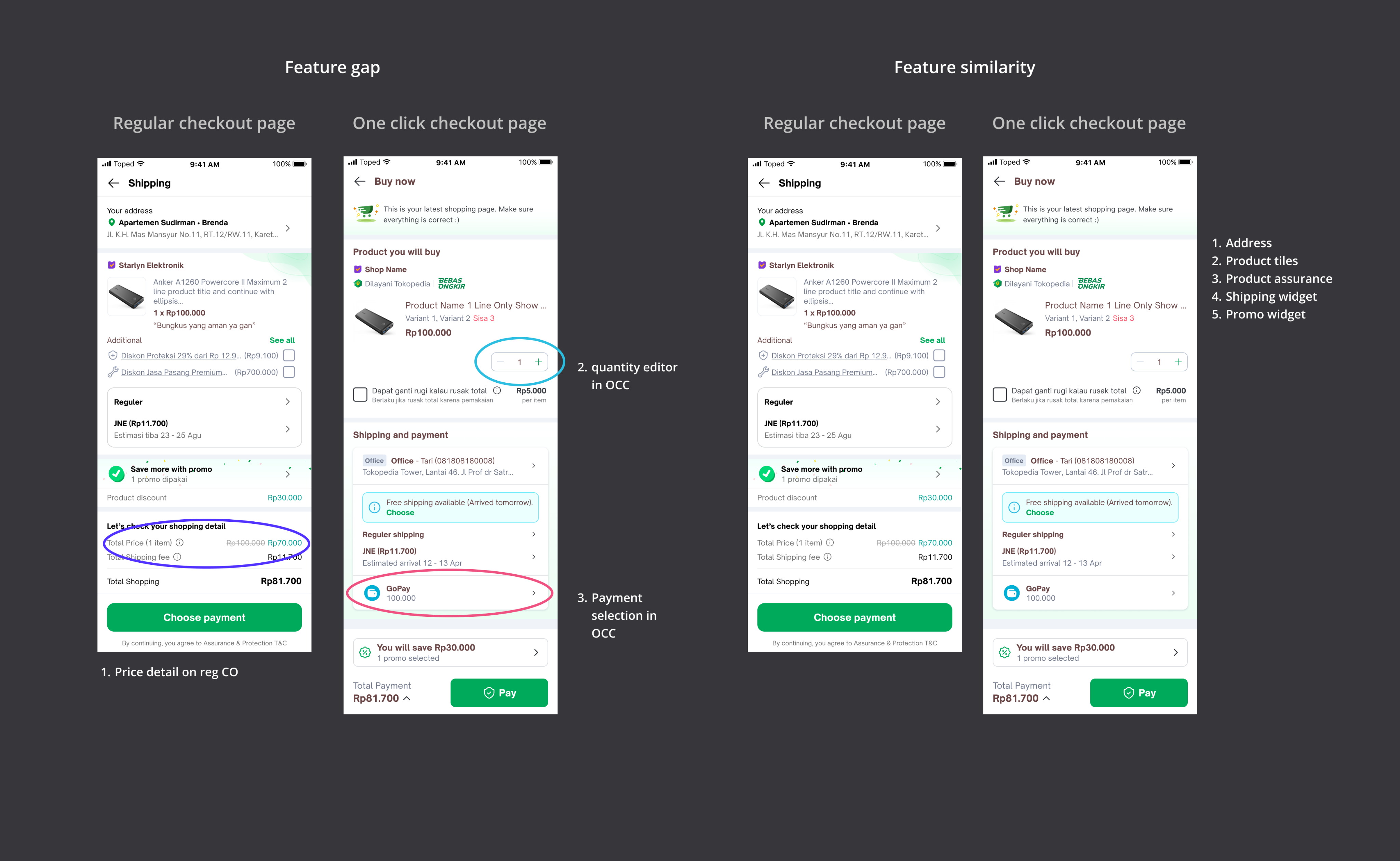
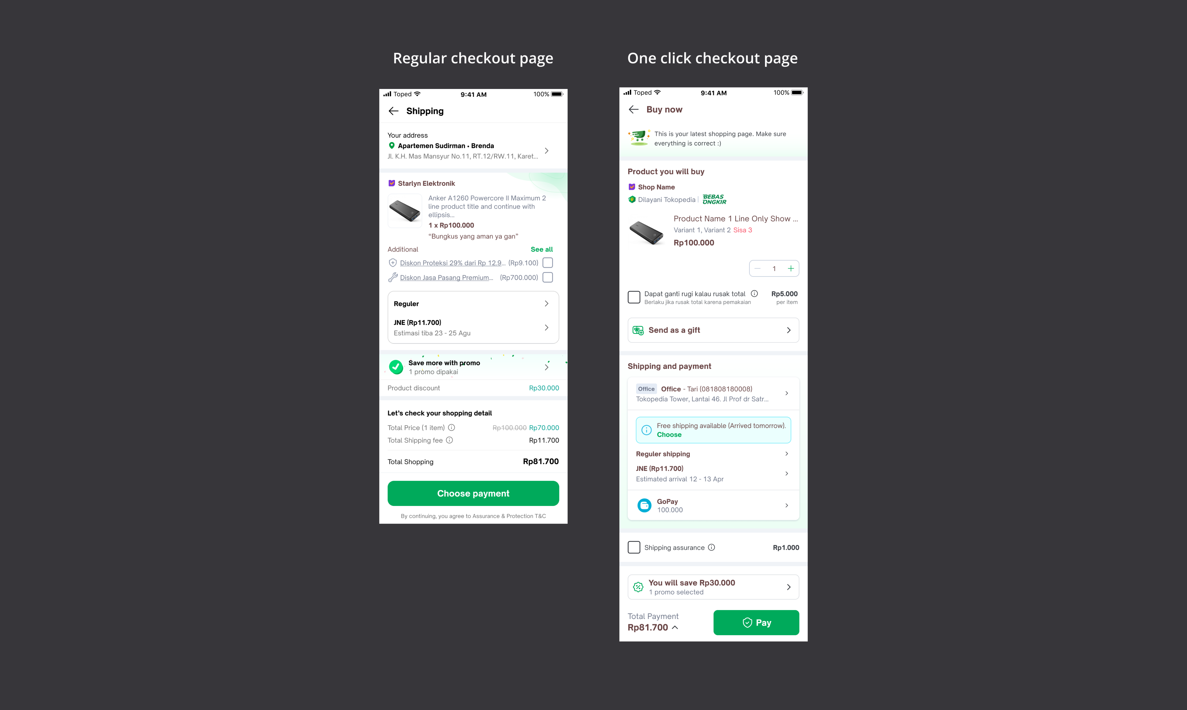
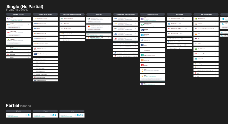
I mapped and clustered the information and features across One Click Checkout and Regular Checkout to identify gaps and understand the unique context of each journey. This helped determine whether either flow had distinct user needs that required different experiences. The analysis showed that One Click Checkout has two unique elements, a quantity editor and payment selection, while all other information and functionality are shared between both checkout flows.
Seeing most of the functions are shared between One Click and Regular Checkout page, my primary objective is to:
Create a scalable checkout design system that supports multiple purchase journeys through a consistent experience.
The main objective is to unify One Click Checkout and Regular Checkout into a single, scalable design system, while optimizing the experience to meet the unique context and user needs of each journey.
Design principle
Checkout page: Transparent, personalized, contextual, straightforward
Checkout remembers my preferences and helps me to purchase my items faster with the relevant offer. All the information shown here should reflect all the choices that I make and I can see them when I need them.
Get deep into the payment module
Studied and mapped out payment module
Because the Payment page was owned by a different team, I invested time in understanding the module by reviewing its end-to-end user flow, payment methods, promotional logic, and all existing use cases before proposing any design changes.
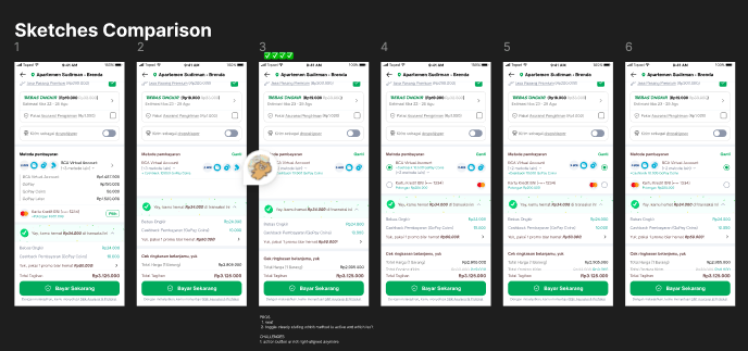
Lot of sketching & thinking
Clustered informations
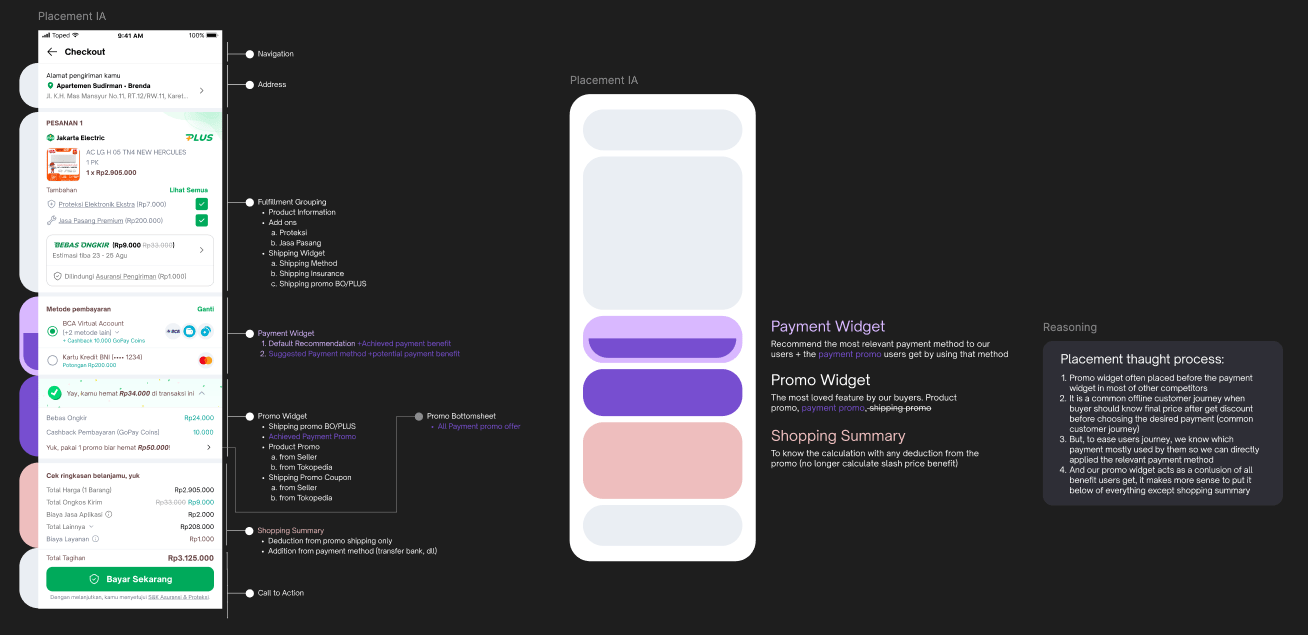
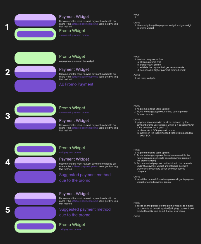
Explored placement of all elements inside checkout page, including payment widget, promo widget, and shopping summary.
Mapped out relation of promotion
Explored the placement and relationship of payment promotion. Collaborated closely with business stakeholders to ensure the design met bank compliance requirements, particularly for payment promotions and the recommended payment method.
Did a lot of explorations
The relationships between payment, checkout, One Click Checkout, promotions, and other modules involved complex use cases. My explorations helped the team build a comprehensive understanding of the end-to-end journey.
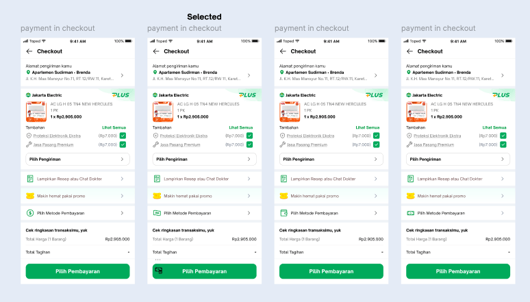
Solution
Scalable checkout design system
Reducing cost by 50% (2 pages → 1 page)Adoption increased +5% (17.2% → 18.1%)
Order Created +3.69%
In this new solution, the One Click Checkout page and Checkout page is sharing the same design system.
One Click Checkout contextual design
Adoption increased +5% (17.2% → 18.1%)
Order Created +3.69%
The new one click checkout is working because adoption rate is growing up, so new one click checkout user don’t feel the knowledge gap anymore and had improved user confident
Cut steps in Reguler Checkout page
Significantly improved:
- CVR Checkout → Order Create +1.7%
- CVR ATC → Order Create +3.4%
In this solution the integration of payment into the page was proven effective. Usability testing also had been done before
Cut steps in Reguler Checkout page
Significantly improved:
- CVR Checkout → Order Create +1.7%
- CVR ATC → Order Create +3.4%
In this solution the integration of payment into the page was proven effective. Usability testing also had been done before
Regular Checkout Introduction Pop up
Cancellation rate stable
In this solution the integration of payment into the page was proven effective. Usability testing also had been done before
Step up to uncertainty in the collaboration
On time schedule
In this solution the integration of payment into the page was proven effective. Usability testing also had been done before
Result 🎉
One click checkout adoption gradually increased +5% (17.2% in April → 17.6% in May → 18.1% in June)
Phase 1 New OCC first launch Q2 2024: CVR of one click checkout +5.96%, GMV +8.91%
Phase 2 New OCC + COD Enablement Q3 2024 (COD is the #1 payment method used by OCC user): Post-rollout: CVR Buy Now → Order Created +6.17%; GMV +15.69%; Paid Order with COD Buy Now +8.4%; Order Create → Payment Success +0.97%
Phase 3 all payment method in OCC Q4 2024: CVR Buy Now → Order Created +3.69%
Phase 4 Shortening regular checkout flow Q4 2024: Decrease main power maintenance 2 pages → 1 page. CVR Checkout → Order Create +1.7% significant, CVR ATC → Order Create +3.4% significant
Phase 5 Multi payment method on payment widget Q1 2025: CVR order create → paid (+0.42%)
Winning the spot bonus individual award
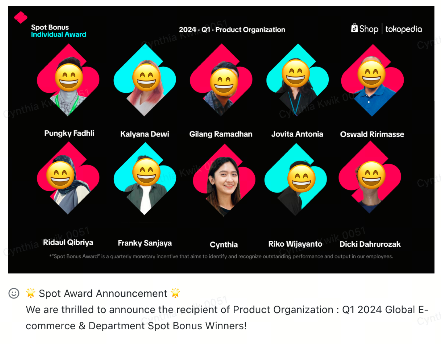
I has consistently demonstrated exceptional dedication and outstanding performance in my role. The initiatives and commitment to excellence contributed the organization and inspired others.
Drives collaboration with Payment and Promotion team by creating a faster iterations, unified experience and logic. Lead and influence design decisions with clear logic reasoning and data-driven insights

Other Projects

See Old Portfolio
→

CONTACT
(+62) 8179880051
cynthiaskwik@gmail.com
SOCIAL
Awarded Organization Spot Bonus Individual Award. Boosted CVR significantly.
Improving Tokopedia checkout page
Context & responsibility
In Q1 2024, I was assigned to improve Tokopedia checkout page. I integrated payment selection into the checkout page to shorten the journey, and unify the OCC and Regular Checkout into one consistent structure, components, and information architecture.
Company
Tokopedia
Release date
Total of 5 phases (Q2 2024 - Q1 2025)
Role
Senior Product Designer
Why I won the Organization Spot Bonus Individual Award?
The project lacked a clear owner and required alignment across 3 big teams with 50+ core user scenarios. I took the lead in driving the initiative, enabling faster and more effective iterations based on user needs
Existing Tokopedia purchase flow
Users are able to enter checkout page directly from product detail page or traditionally from shopping cart page. After they enter checkout page, they have to go to payment page first then order is created. We see a lot of opportunities to improve in this purchase journey.
Identifying key problems
Analyze data and research
To get better understanding of how users interact with current design, finding pain point.
Competitive analysis
To discover feature gaps between Tokopedia and the competitors, by doing so we can find improvement opportunities.
Design audit
To get better understanding of own design structure. Finding inconsistency and usability issues.
3 main problems that I found
One click checkout page high exit rate
83.59% of buy now bounce and never order. ~11% order the same cart later, ~2.5% switch to regular checkout in same-day. But do we need this page in the first place? The answer is yes, it still shared 17.2% order of all order in Tokopedia. Hypothetically speaking, Tokopedia users ~83%
- High cost on maintaining two checkout pages
Separate checkout pages require duplicated design, engineering, QA, and maintenance efforts while serving the same purchasing goal. This limits scalability and slows future improvements.
- Too many steps to play an order
Current flow, user has to go through 4 pages, ≥ 7 clicks to place one order (Cart → SAF/Checkout → Payment list → Thank You).
These steps proven a pain point to the user through 3 data I got:
Competitive benchmarking
Most major competitors already implement payment-in-checkout for a seamless experience.
Observation
Users are bouncing back from the Payment page to the Checkout page, indicating the dedicated payment step created friction and lower the conversion rate.
Research
User said “I need to go go through multiple pages to proceed to payment, and I need to go back and forth between checkout and payment page to check everything”
I am also looking for supporting data and found ~11.13% of Buy Now users actively click "payment" on the one click checkout page widget meaning ~89% accept the pre-selected recommended payment method without ever opening the full list. So hypothesis integrating payment into the checkout page might be the solution.
How might we
To tackle those issues, 3 points need to be addressed
How might we
improve one click checkout user journey?
How might we
deliver a consistent and scalable checkout experience across different purchase journeys?
How might we
escalate user shopping journey while also minimizing order cancellations?
Objectives
Improve one click checkout experiences that encourages user to complete the purchase
Objectives
Create a consistent and scalable checkout experience across different purchase flows.
Objectives
Simplify the checkout process while ensuring users can confidently review and complete their orders.
How I solved it, starting by mapping out
I mapped and clustered the information and features across One Click Checkout and Regular Checkout to identify gaps and understand the unique context of each journey. This helped determine whether either flow had distinct user needs that required different experiences. The analysis showed that One Click Checkout has two unique elements, a quantity editor and payment selection, while all other information and functionality are shared between both checkout flows.
Seeing most of the functions are shared between One Click and Regular Checkout page, my primary objective is to:
Create a scalable checkout design system that supports multiple purchase journeys through a consistent experience.
The main objective is to unify One Click Checkout and Regular Checkout into a single, scalable design system, while optimizing the experience to meet the unique context and user needs of each journey.
Design principle
Checkout page: Transparent, personalized, contextual, straightforward
Checkout remembers my preferences and helps me to purchase my items faster with the relevant offer. All the information shown here should reflect all the choices that I make and I can see them when I need them.
Get deep into the payment module
Studied and mapped out payment module
Because the Payment page was owned by a different team, I invested time in understanding the module by reviewing its end-to-end user flow, payment methods, promotional logic, and all existing use cases before proposing any design changes.
Lot of sketching & thinking
Clustered informations
Explored placement of all elements inside checkout page, including payment widget, promo widget, and shopping summary.
Mapped out relation of promotion
Explored the placement and relationship of payment promotion. Collaborated closely with business stakeholders to ensure the design met bank compliance requirements, particularly for payment promotions and the recommended payment method.
Did a lot of explorations
The relationships between payment, checkout, One Click Checkout, promotions, and other modules involved complex use cases. My explorations helped the team build a comprehensive understanding of the end-to-end journey.
Solution
Scalable checkout design system
Reducing cost by 50% (2 pages → 1 page)Adoption increased +5% (17.2% → 18.1%)
Order Created +3.69%
In this new solution, the One Click Checkout page and Checkout page is sharing the same design system.
One Click Checkout contextual design
Adoption increased +5% (17.2% → 18.1%)
Order Created +3.69%
The new one click checkout is working because adoption rate is growing up, so new one click checkout user don’t feel the knowledge gap anymore and had improved user confident
Cut steps in Reguler Checkout page
Significantly improved:
- CVR Checkout → Order Create +1.7%
- CVR ATC → Order Create +3.4%
In this solution the integration of payment into the page was proven effective. Usability testing also had been done before
Cut steps in Reguler Checkout page
Significantly improved:
- CVR Checkout → Order Create +1.7%
- CVR ATC → Order Create +3.4%
In this solution the integration of payment into the page was proven effective. Usability testing also had been done before
Regular Checkout Introduction Pop up
Cancellation rate stable
In this solution the integration of payment into the page was proven effective. Usability testing also had been done before
Step up to uncertainty in the collaboration
On time schedule
In this solution the integration of payment into the page was proven effective. Usability testing also had been done before
Result 🎉
One click checkout adoption gradually increased +5% (17.2% in April → 17.6% in May → 18.1% in June)
Phase 1 New OCC first launch Q2 2024: CVR of one click checkout +5.96%, GMV +8.91%
Phase 2 New OCC + COD Enablement Q3 2024 (COD is the #1 payment method used by OCC user): Post-rollout: CVR Buy Now → Order Created +6.17%; GMV +15.69%; Paid Order with COD Buy Now +8.4%; Order Create → Payment Success +0.97%
Phase 3 all payment method in OCC Q4 2024: CVR Buy Now → Order Created +3.69%
Phase 4 Shortening regular checkout flow Q4 2024: Decrease main power maintenance 2 pages → 1 page. CVR Checkout → Order Create +1.7% significant, CVR ATC → Order Create +3.4% significant
Phase 5 Multi payment method on payment widget Q1 2025: CVR order create → paid (+0.42%)
Winning the spot bonus individual award
I has consistently demonstrated exceptional dedication and outstanding performance in my role. The initiatives and commitment to excellence contributed the organization and inspired others.
Drives collaboration with Payment and Promotion team by creating a faster iterations, unified experience and logic. Lead and influence design decisions with clear logic reasoning and data-driven insights

Other Projects
See Old Portfolio
→
CONTACT
(+62) 8179880051
cynthiaskwik@gmail.com
SOCIAL
Awarded Organization Spot Bonus Individual Award. Boosted CVR significantly.
Improving Tokopedia checkout page
Context & responsibility
In Q1 2024, I was assigned to improve Tokopedia checkout page. I integrated payment selection into the checkout page to shorten the journey, and unify the OCC and Regular Checkout into one consistent structure, components, and information architecture.
Company
Tokopedia
Release date
Total of 5 phases (Q2 2024 - Q1 2025)
Role
Senior Product Designer
Why I won the Organization Spot Bonus Individual Award?
The project lacked a clear owner and required alignment across 3 big teams with 50+ core user scenarios. I took the lead in driving the initiative, enabling faster and more effective iterations based on user needs
Existing Tokopedia purchase flow
Users are able to enter checkout page directly from product detail page or traditionally from shopping cart page. After they enter checkout page, they have to go to payment page first then order is created. We see a lot of opportunities to improve in this purchase journey.
Identifying key problems
Analyze data and research
To get better understanding of how users interact with current design, finding pain point.
Competitive analysis
To discover feature gaps between Tokopedia and the competitors, by doing so we can find improvement opportunities.
Design audit
To get better understanding of own design structure. Finding inconsistency and usability issues.
3 main problems that I found
- One click checkout page has high exit rate
83.59% of buy now bounce and never order, ~11% order the same cart later, and ~2.5% switch to regular checkout in same-day. But do we need this page in the first place? The answer is yes, it still shared 17.2% order of all order in Tokopedia.
One hypothesis is that users are already familiar with the Regular Checkout experience. Encountering two checkout pages with different layouts and interactions creates unnecessary cognitive load and reduces user confidence.
- High cost on maintaining two checkout pages
Separate checkout pages require duplicated design, engineering, QA, and maintenance efforts while serving the same purchasing goal. This limits scalability and slows future improvements.
- Too many steps to place an order
On current flow, user has to go through 4 pages and at least 7 clicks to place one order (Cart → Checkout → Payment list → Thank You).
These steps proven a pain point to the user through 3 data I got:
Competitive benchmarking
Most major competitors already implement payment-in-checkout for a seamless experience.
Observation
Users are bouncing back from the Payment page to the Checkout page, indicating the dedicated payment step created friction and lower the conversion rate.
Research
User said “I need to go go through multiple pages to proceed to payment, and I need to go back and forth between checkout and payment page to check everything”
I am also looking for supporting data and found ~11.13% of Buy Now users actively click "payment" on the one click checkout page widget meaning ~89% accept the pre-selected recommended payment method without ever opening the full list. So hypothesis integrating payment into the checkout page might be the solution.
How might we
To tackle those issues, 3 points need to be addressed
How might we
improve one click checkout user journey?
How might we
deliver a consistent and scalable checkout experience across different purchase journeys?
How might we
escalate user shopping journey while also minimizing order cancellations?
Objectives
Improve one click checkout experiences that encourages user to complete the purchase
Objectives
Create a consistent and scalable checkout experience across different purchase flows.
Objectives
Simplify the checkout process while ensuring users can confidently review and complete their orders.
How I solved it, starting by mapping out
I mapped and clustered the information and features across One Click Checkout and Regular Checkout to identify gaps and understand the unique context of each journey. This helped determine whether either flow had distinct user needs that required different experiences. The analysis showed that One Click Checkout has two unique elements, a quantity editor and payment selection, while all other information and functionality are shared between both checkout flows.
Seeing most of the functions are shared between One Click and Regular Checkout page, my primary objective is to:
Create a scalable checkout design system that supports multiple purchase journeys through a consistent experience.
The main objective is to unify One Click Checkout and Regular Checkout into a single, scalable design system, while optimizing the experience to meet the unique context and user needs of each journey.
Design principle
Checkout page: Transparent, personalized, contextual, straightforward
Checkout remembers my preferences and helps me to purchase my items faster with the relevant offer. All the information shown here should reflect all the choices that I make and I can see them when I need them.
Get deep into the payment module
Studied and mapped out payment module
Because the Payment page was owned by a different team, I invested time in understanding the module by reviewing its end-to-end user flow, payment methods, promotional logic, and all existing use cases before proposing any design changes.
Lot of sketching & thinking
Clustered informations
Explored placement of all elements inside checkout page, including payment widget, promo widget, and shopping summary.
Mapped out relation of promotion
Explored the placement and relationship of payment promotion. Collaborated closely with business stakeholders to ensure the design met bank compliance requirements, particularly for payment promotions and the recommended payment method.
Did a lot of explorations
The relationships between payment, checkout, One Click Checkout, promotions, and other modules involved complex use cases. My explorations helped the team build a comprehensive understanding of the end-to-end journey.
Solution
Scalable checkout design system
Reducing cost by 50% (2 pages → 1 page)Adoption increased +5% (17.2% → 18.1%)
Order Created +3.69%
In this new solution, the One Click Checkout page and Checkout page is sharing the same design system.
One Click Checkout contextual design
Adoption increased +5% (17.2% → 18.1%)
Order Created +3.69%
The new one click checkout is working because adoption rate is growing up, so new one click checkout user don’t feel the knowledge gap anymore and had improved user confident
Cut steps in Reguler Checkout page
Significantly improved:
- CVR Checkout → Order Create +1.7%
- CVR ATC → Order Create +3.4%
In this solution the integration of payment into the page was proven effective. Usability testing also had been done before
Cut steps in Reguler Checkout page
Significantly improved:
- CVR Checkout → Order Create +1.7%
- CVR ATC → Order Create +3.4%
In this solution the integration of payment into the page was proven effective. Usability testing also had been done before
Regular Checkout Introduction Pop up
Cancellation rate stable
In this solution the integration of payment into the page was proven effective. Usability testing also had been done before
Step up to uncertainty in the collaboration
On time schedule
In this solution the integration of payment into the page was proven effective. Usability testing also had been done before
Result 🎉
One click checkout adoption gradually increased +5% (17.2% in April → 17.6% in May → 18.1% in June)
Phase 1 New OCC first launch Q2 2024: CVR of one click checkout +5.96%, GMV +8.91%
Phase 2 New OCC + COD Enablement Q3 2024 (COD is the #1 payment method used by OCC user): Post-rollout: CVR Buy Now → Order Created +6.17%; GMV +15.69%; Paid Order with COD Buy Now +8.4%; Order Create → Payment Success +0.97%
Phase 3 all payment method in OCC Q4 2024: CVR Buy Now → Order Created +3.69%
Phase 4 Shortening regular checkout flow Q4 2024: Decrease main power maintenance 2 pages → 1 page. CVR Checkout → Order Create +1.7% significant, CVR ATC → Order Create +3.4% significant
Phase 5 Multi payment method on payment widget Q1 2025: CVR order create → paid (+0.42%)
Winning the spot bonus individual award
I has consistently demonstrated exceptional dedication and outstanding performance in my role. The initiatives and commitment to excellence contributed the organization and inspired others.
Drives collaboration with Payment and Promotion team by creating a faster iterations, unified experience and logic. Lead and influence design decisions with clear logic reasoning and data-driven insights

Other Projects
See Old Portfolio
→
CONTACT
(+62) 8179880051
cynthiaskwik@gmail.com
SOCIAL