Cynthia Kwik
Menu
Work
About
Contact
Redesigning Tokopedia product card
Release date
2023
Design timeline
5 months
Company
Tokopedia
Role
Senior Product Designer main PIC
Problem
Users are finding it hard to get the main information on the product card, which makes it hard to compare between products.
Solution
Simplifying product card information and interface to improve product comparison.
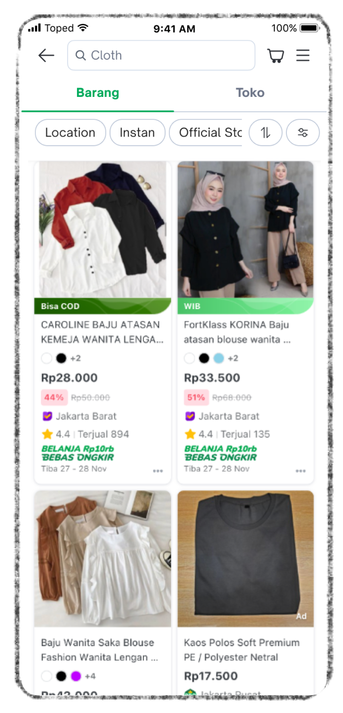
Before
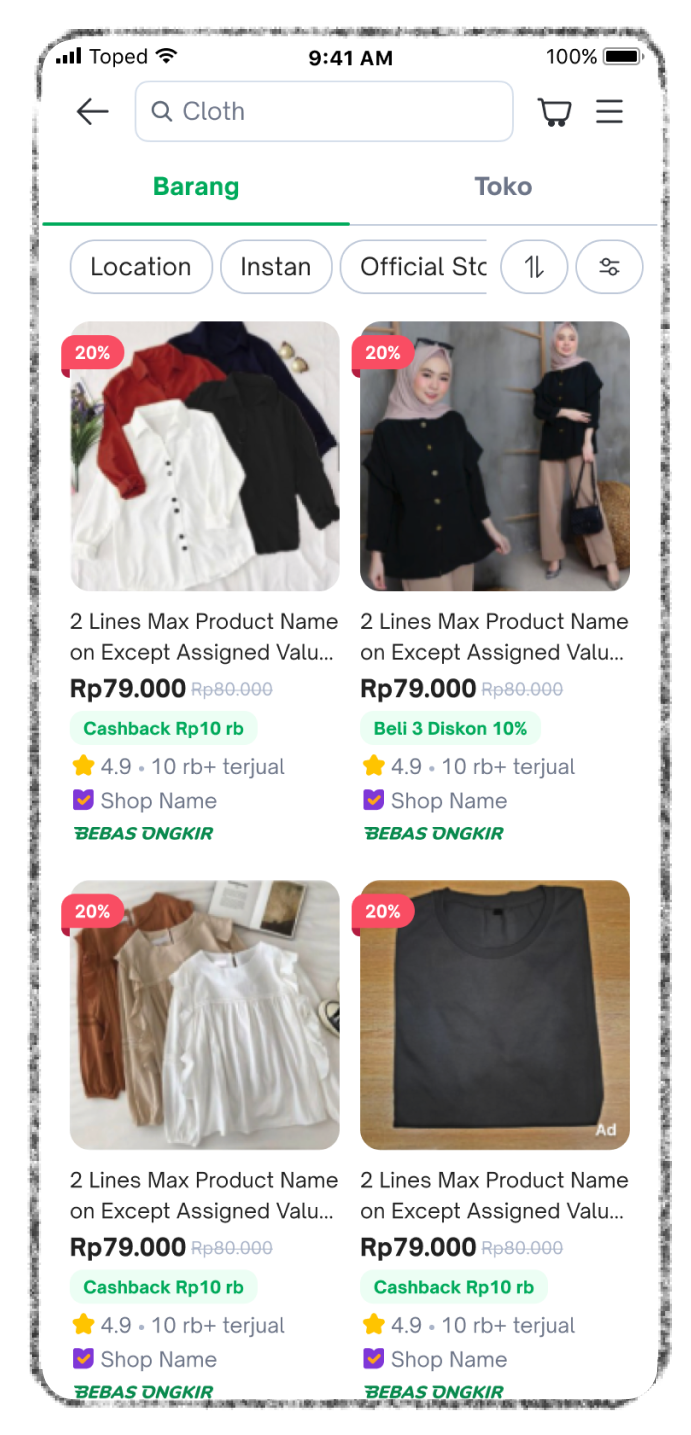
After
Result
↑8.24%
Impression (engagement)
↑1.17%
CVR paid order

Problem discovery
How it started
We saw a declining data trend from search result to product detail page and conversion.
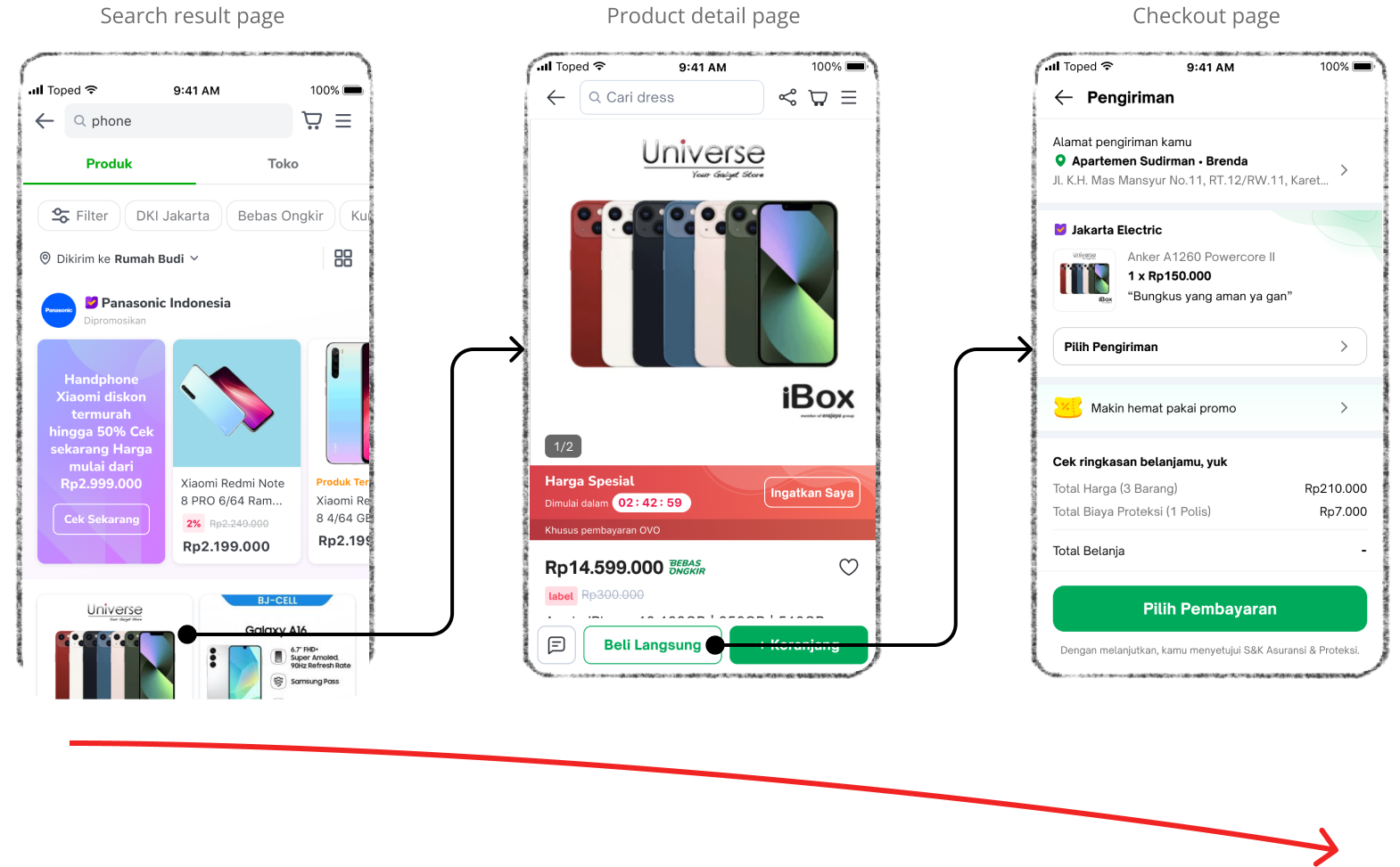
Initial hypothesis
This might had been because it was hard to browse and compare between product on the search result page, because product card information was too crowded and long.
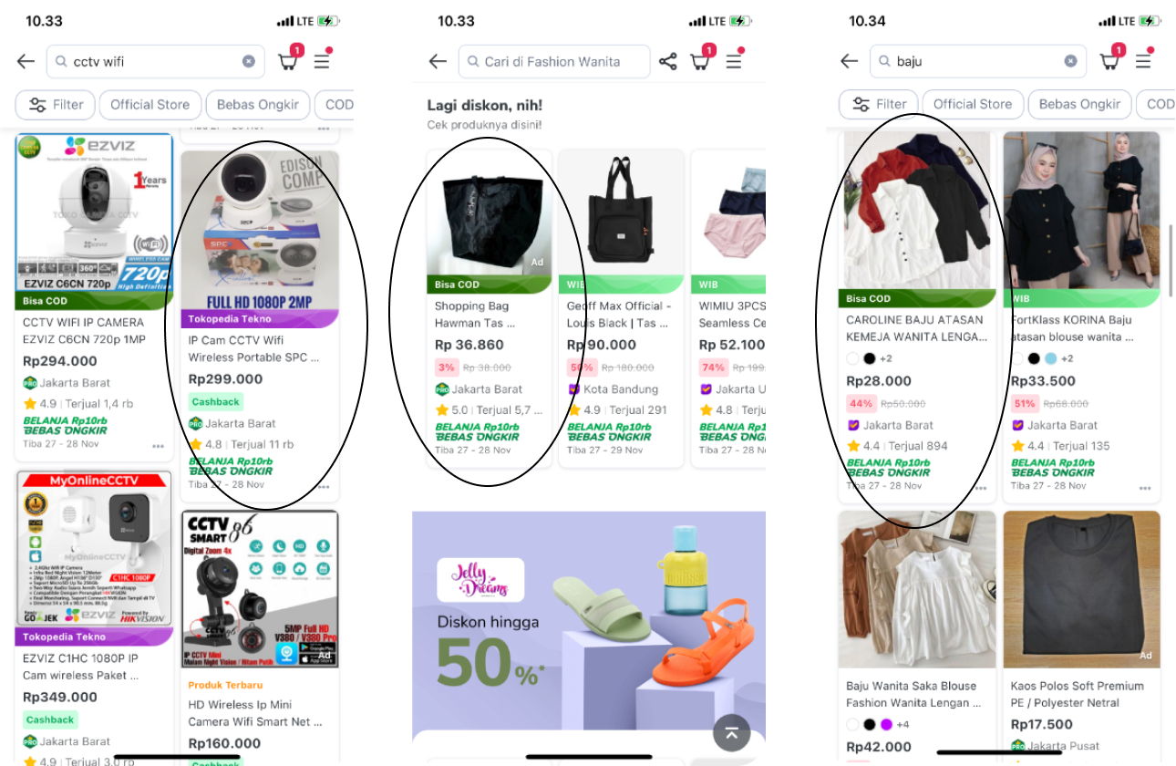
More problem
- The UI felt outdated, such as the drop shadow used behind container cards. There were also experience gaps between pages on the platform where different teams were crafting and developing their own product card style and it became uncontrollable.
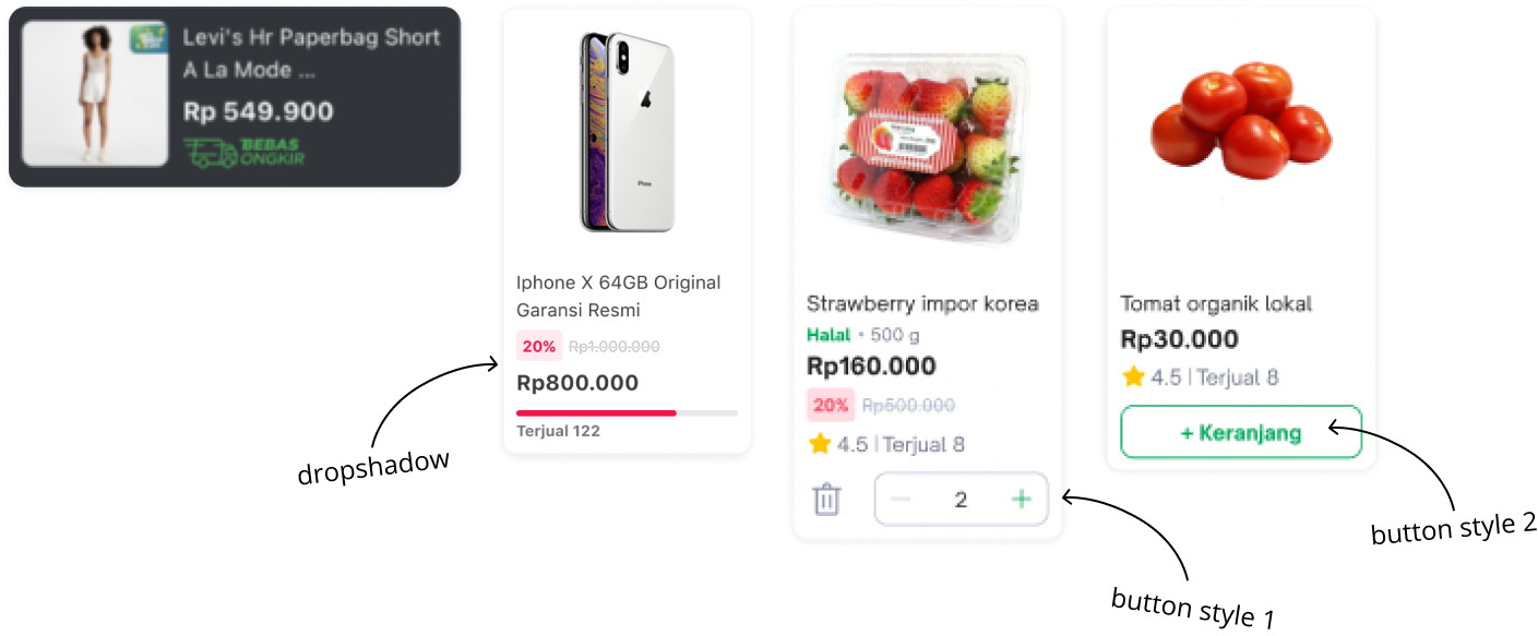
- Stakeholders wanted to put more information on product card, and we didn’t have guideline to maintain it.
After all the problems found with various ways, we decided to focus on these,
Objectives
- Simplify product card information
- Improve interface of the product card
- Create a modular guideline to maintain consistency of the product card
Design & exploration
Data collection
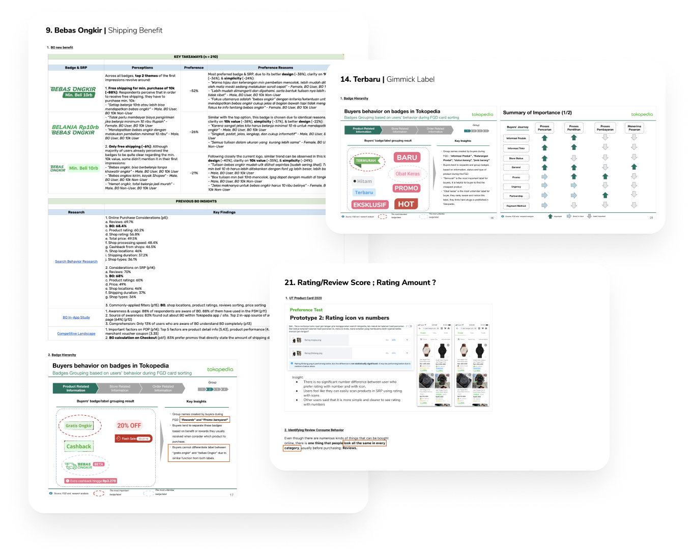
Collected past experiments data to support design decision. I always begin by understanding the objective of a component or a function rather than jumping straight into the design output.
workshop
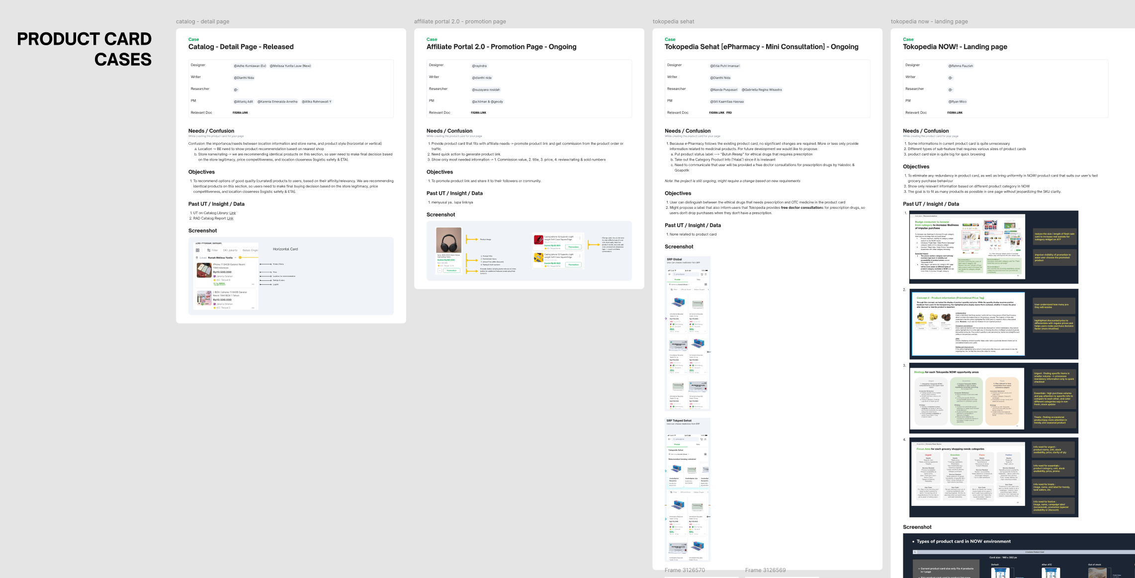
Conducted a workshop with 14 different teams to gather requirements and objectives. This workshop was aimed to support the design decision of our objectives which are simplify informations and upgrade the UI. We had to ensure consistency across platform while also be open to everyone requirements.
collaborate with tech
Initiated early tech discussion to support modular guideline creation. Since guidelines are often overlooked or poorly implemented, I involved engineers from the start to identify the best approach. This ensured all teams could use the same code base, resulting in more consistent and efficient design creation.
Solution
Solution 1
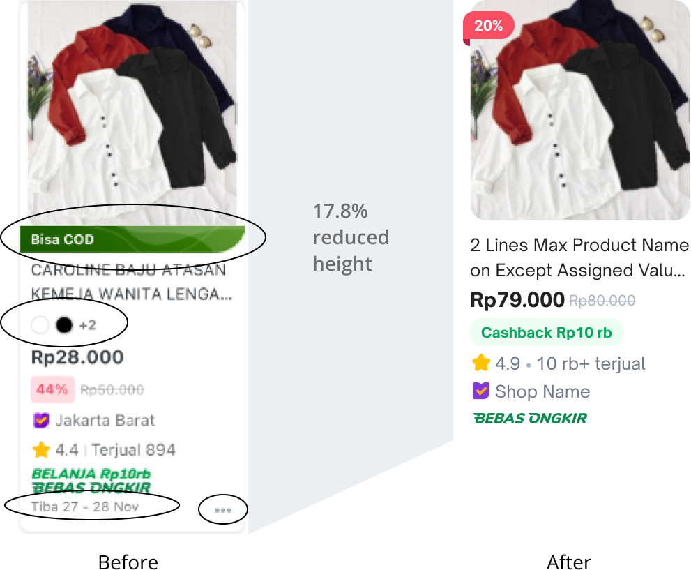
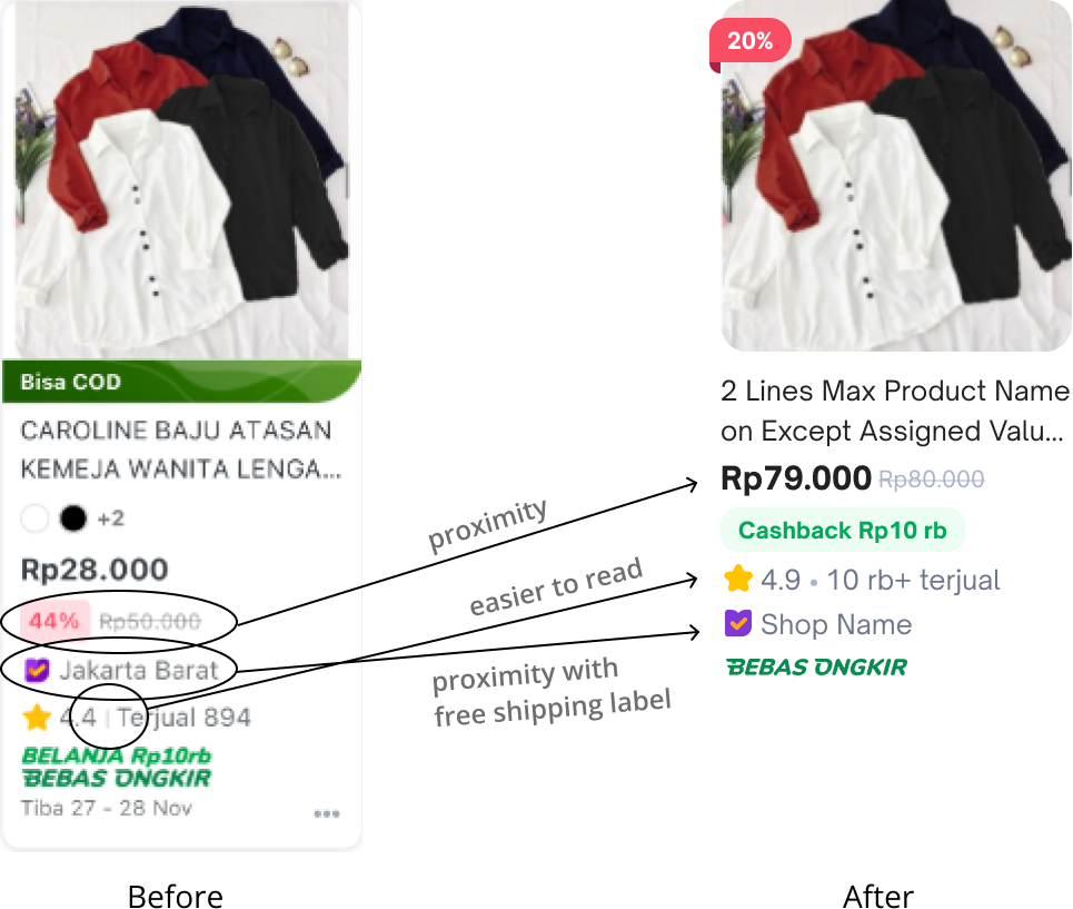
To simplify, we decluttered unnecessary information and put element on the best hierarchy. A removal of less-priority elements based on data and research. Improved slash price expression to reduce card height.
Solution 2
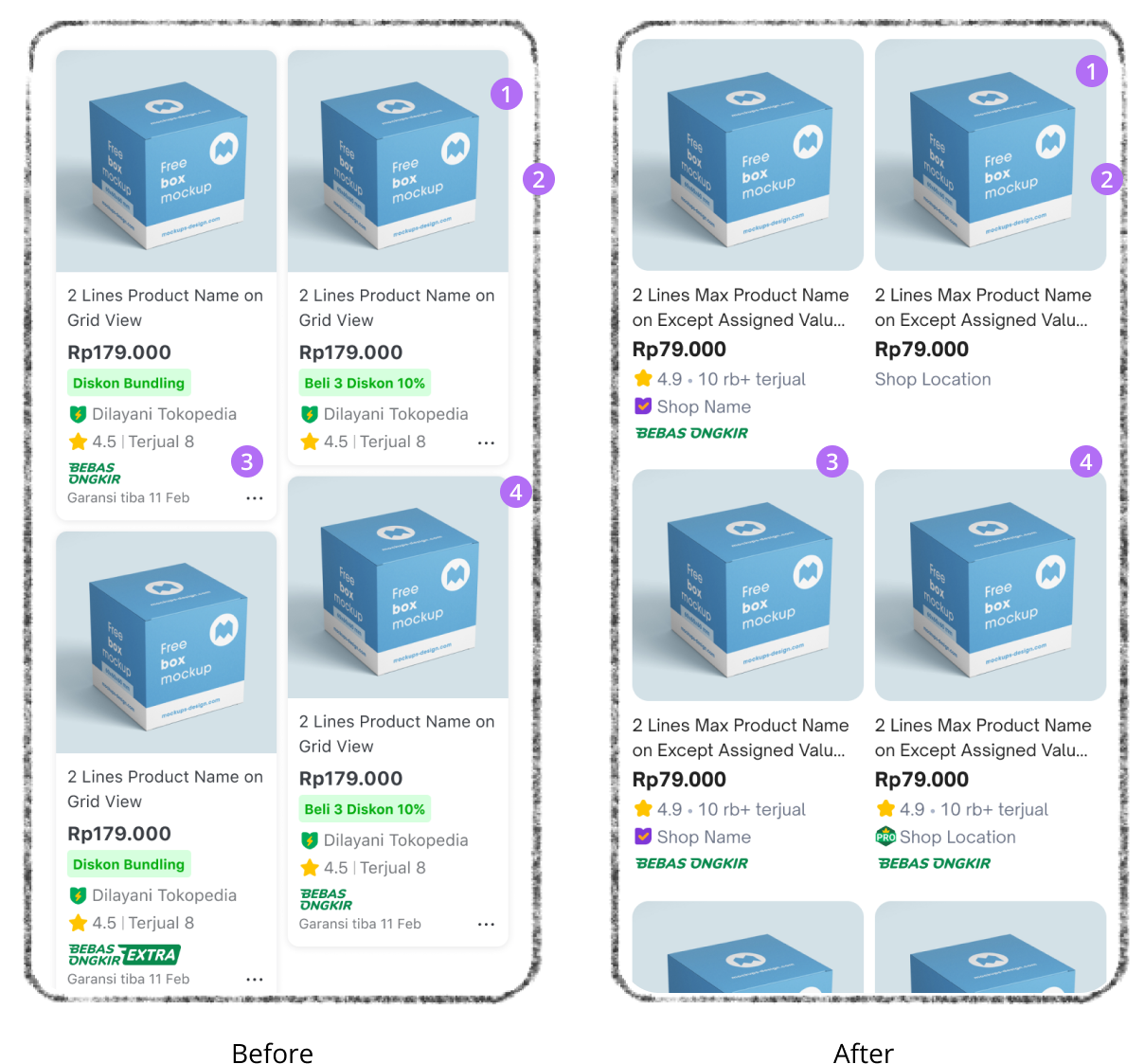
Improved interface of the product card. The new product card feels more modern, clean, and bigger. Users able to compare and browse more easily with the improved UI.

1
More rounding, modern look
2
Reduce page padding to enlarge the product image and elements
3
No more different height. Always in fix height for better comparison skimming
4
No more drop shadow and container card to give more space to product elements
Solution 3
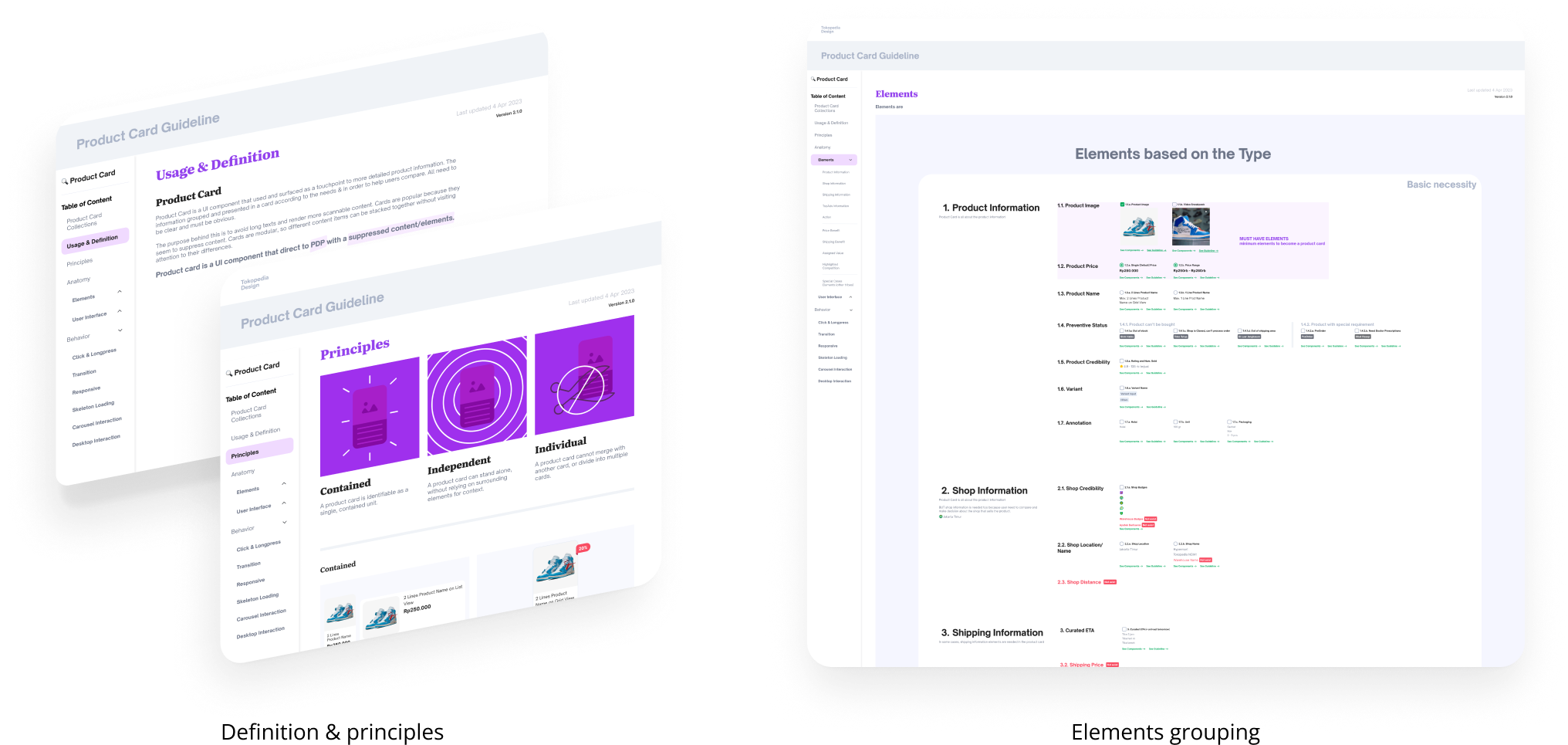
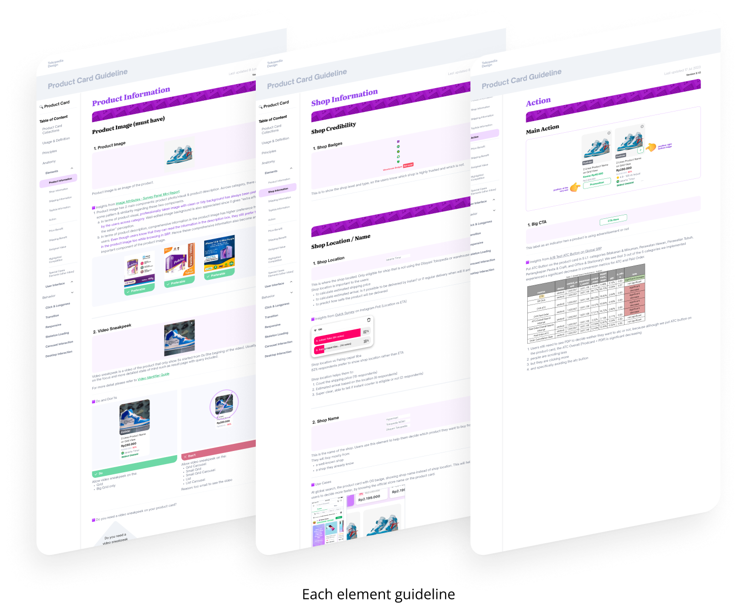
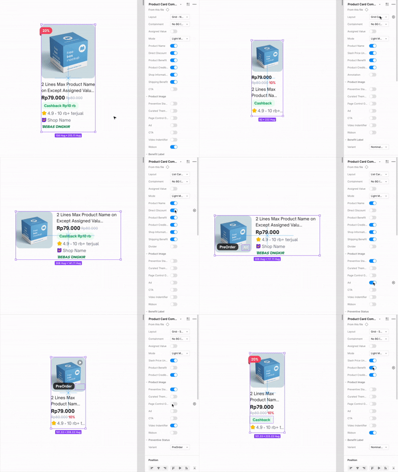
Published guideline and component library. I catered all 14 teams’ product card requirements into this guideline, so it was a well-thought-complete guideline for all to use. It was hard tho, but the results were worth it.
Solution 4
Product card is modular to every funnel in Tokopedia. With a plug-and-play approach, teams could easily create product cards by reusing guideline components and specifying the required elements for development. This streamlined the process, making implementation faster and more consistent.
Impact!
↑8.24%
Impression (engagement)
↑1.17%
CVR paid order
Excessive word count and worthless details are making it harder for people to extract useful information. The more you say, the more people tune out your message.
Faster scanning, faster comparing, more buying
Creation time
saved ~1 business day
Based on surveys to other colleauges

Other Projects


CONTACT
(+62) 8179880051
cynthiaskwik@gmail.com
SOCIAL
Redesigning Tokopedia product card
Release date
2023
Design timeline
5 months
Company
Tokopedia
Role
Senior Product Designer main PIC
Problem
Users are finding it hard to get the main information on the product card, which makes it hard to compare between products.
Solution
Simplifying product card information and interface to improve product comparison.
Before
After
Result
↑8.24%
Impression (engagement)
↑1.17%
CVR paid order
Problem discovery
How it started
We saw a declining data trend from search result to product detail page and conversion.
Initial hypothesis
This might had been because it was hard to browse and compare between product on the search result page, because product card information was too crowded and long.
More problem
- The UI felt outdated, such as the drop shadow used behind container cards. There were also experience gaps between pages on the platform where different teams were crafting and developing their own product card style and it became uncontrollable.
- Stakeholders wanted to put more information on product card, and we didn’t have guideline to maintain it.
After all the problems found with various ways, we decided to focus on these,
Objectives
- Simplify product card information
- Improve interface of the product card
- Create a modular guideline to maintain consistency of the product card
Design & exploration
Data collection
Collected past experiments data to support design decision. I always begin by understanding the objective of a component or a function rather than jumping straight into the design output.
workshop
Conducted a workshop with 14 different teams to gather requirements and objectives. This workshop was aimed to support the design decision of our objectives which are simplify informations and upgrade the UI. We had to ensure consistency across platform while also be open to everyone requirements.
collaborate with tech
Initiated early tech discussion to support modular guideline creation. Since guidelines are often overlooked or poorly implemented, I involved engineers from the start to identify the best approach. This ensured all teams could use the same code base, resulting in more consistent and efficient design creation.
Solution
Solution 1
To simplify, we decluttered unnecessary information and put element on the best hierarchy. A removal of less-priority elements based on data and research. Improved slash price expression to reduce card height.
Solution 2
Improved interface of the product card. The new product card feels more modern, clean, and bigger. Users able to compare and browse more easily with the improved UI.
1
More rounding, modern look
2
Reduce page padding to enlarge the product image and elements
3
No more different height. Always in fix height for better comparison skimming
4
No more drop shadow and container card to give more space to product elements
Solution 3
Published guideline and component library. I catered all 14 teams’ product card requirements into this guideline, so it was a well-thought-complete guideline for all to use. It was hard tho, but the results were worth it.
Solution 4
Product card is modular to every funnel in Tokopedia. With a plug-and-play approach, teams could easily create product cards by reusing guideline components and specifying the required elements for development. This streamlined the process, making implementation faster and more consistent.
Impact!
↑8.24%
Impression (engagement)
↑1.17%
CVR paid order
Excessive word count and worthless details are making it harder for people to extract useful information. The more you say, the more people tune out your message.
Faster scanning, faster comparing, more buying
Creation time
saved ~1 business day
Based on surveys to other colleauges

Other Projects
CONTACT
(+62) 8179880051
cynthiaskwik@gmail.com
SOCIAL
Redesigning Tokopedia product card
Release date
2023
Design timeline
5 months
Company
Tokopedia
Role
Senior Product Designer main PIC
Problem
Users are finding it hard to get the main information on the product card, which makes it hard to compare between products.
Solution
Simplifying product card information and interface to improve product comparison.
Before
After
Result
↑8.24%
Impression (engagement)
↑1.17%
CVR paid order
Problem discovery
How it started
We saw a declining data trend from search result to product detail page and conversion.
Initial hypothesis
This might had been because it was hard to browse and compare between product on the search result page, because product card information was too crowded and long.
More problem
- The UI felt outdated, such as the drop shadow used behind container cards. There were also experience gaps between pages on the platform where different teams were crafting and developing their own product card style and it became uncontrollable.
- Stakeholders wanted to put more information on product card, and we didn’t have guideline to maintain it.
After all the problems found with various ways, we decided to focus on these,
Objectives
- Simplify product card information
- Improve interface of the product card
- Create a modular guideline to maintain consistency of the product card
Design & exploration
Data collection
Collected past experiments data to support design decision. I always begin by understanding the objective of a component or a function rather than jumping straight into the design output.
workshop
Conducted a workshop with 14 different teams to gather requirements and objectives. This workshop was aimed to support the design decision of our objectives which are simplify informations and upgrade the UI. We had to ensure consistency across platform while also be open to everyone requirements.
collaborate with tech
Initiated early tech discussion to support modular guideline creation. Since guidelines are often overlooked or poorly implemented, I involved engineers from the start to identify the best approach. This ensured all teams could use the same code base, resulting in more consistent and efficient design creation.
Solution
Solution 1
To simplify, we decluttered unnecessary information and put element on the best hierarchy. A removal of less-priority elements based on data and research. Improved slash price expression to reduce card height.
Solution 2
Improved interface of the product card. The new product card feels more modern, clean, and bigger. Users able to compare and browse more easily with the improved UI.
1
More rounding, modern look
2
Reduce page padding to enlarge the product image and elements
3
No more different height. Always in fix height for better comparison skimming
4
No more drop shadow and container card to give more space to product elements
Solution 3
Published guideline and component library. I catered all 14 teams’ product card requirements into this guideline, so it was a well-thought-complete guideline for all to use. It was hard tho, but the results were worth it.
Solution 4
Product card is modular to every funnel in Tokopedia. With a plug-and-play approach, teams could easily create product cards by reusing guideline components and specifying the required elements for development. This streamlined the process, making implementation faster and more consistent.
Impact!
↑8.24%
Impression (engagement)
↑1.17%
CVR paid order
Excessive word count and worthless details are making it harder for people to extract useful information. The more you say, the more people tune out your message.
Faster scanning, faster comparing, more buying
Creation time
saved ~1 business day
Based on surveys to other colleauges

Other Projects
CONTACT
(+62) 8179880051
cynthiaskwik@gmail.com
SOCIAL